Understanding the basics of color theory (which artists often use to guide them when they mix paint) can help explain why certain combinations work for you, and why others don't.� It can help you combine different colors of blooms, foliage and other elements in ways that you find pleasing.
Don't limit your color thinking to just blooms.� You have extensive color choices with foliage, too.� Beyond the many shades of greens, foliage comes in countless yellows, reds, blues, grays, and earth tones.� Bark, buds, fruit and other plant parts contribute to your palette, as well.
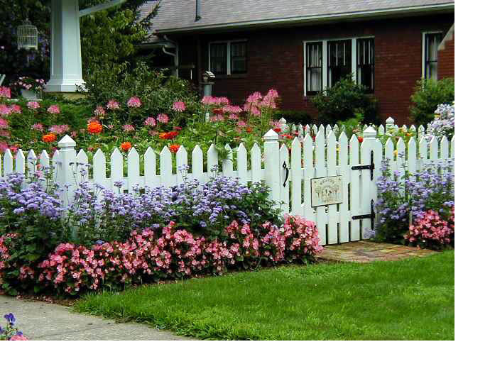
Use color on structures for interesting effects.� Split rail fences, arbors, seating, structures and enhancements don�t have to be dull brown or black.� Painted pots and boldly colored window boxes can complement or contrast with plantings.� A vivid blue bench, brightly painted birdhouse or purple dog house can liven up your landscape.
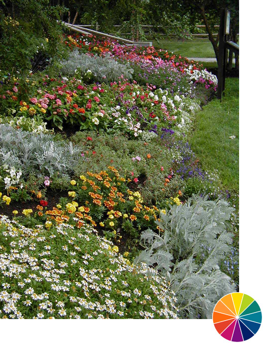
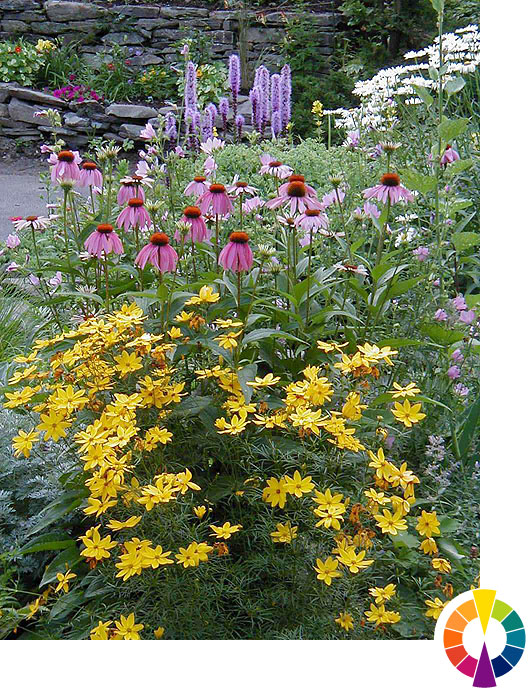
Keep in mind as you plan that most landscape and garden designers agree that color schemes are more effective when you use large masses of color, and not single plants or blossoms in a scheme.� Group plants in drifts for maximum impact.
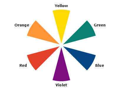
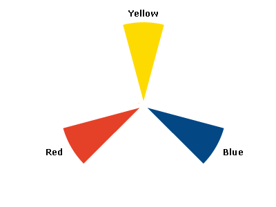
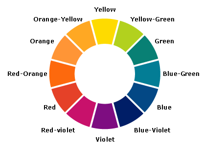
Let�s start with a simple color wheel which is essentially the colors of the rainbow arranged around a circle.� Note that on one side of the wheel are what we call warm colors -- yellows, oranges and reds.
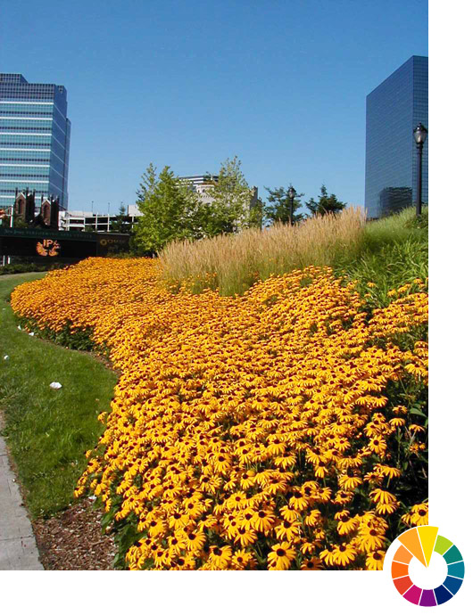
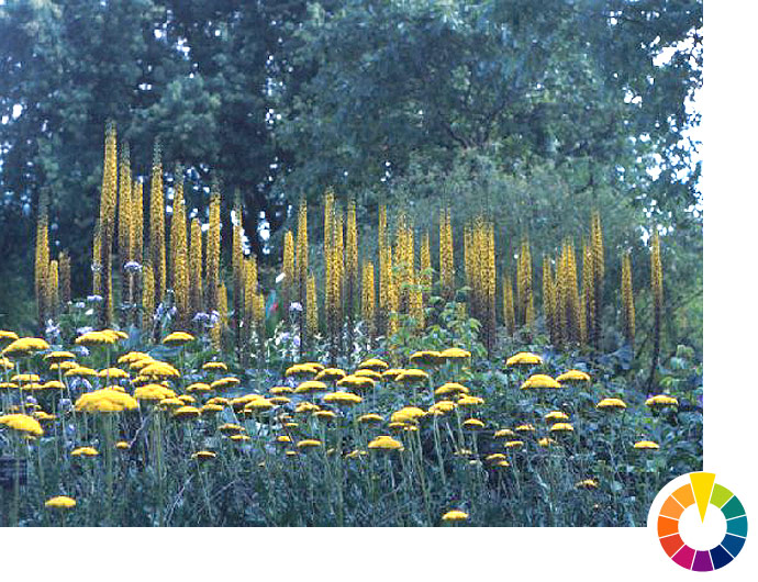
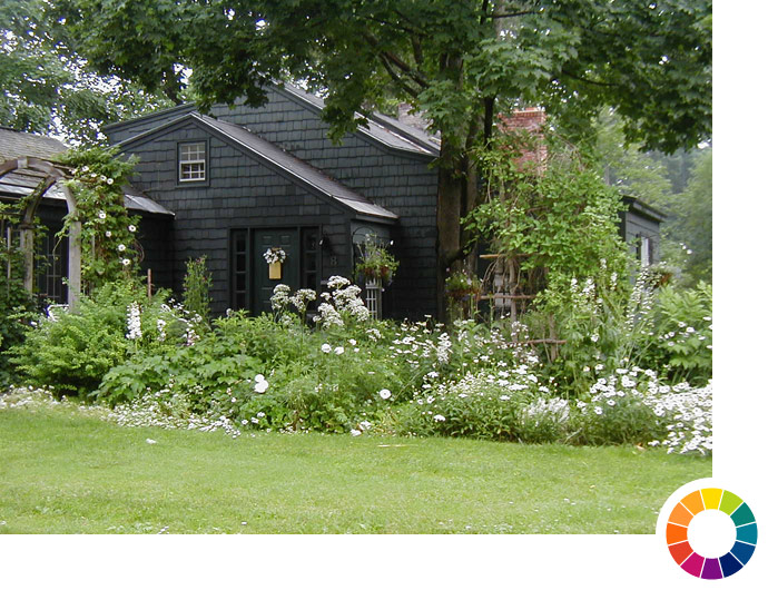
Warm colors appear to come forward in the landscape, and seem closer than they really are.� They make big spaces feel smaller. Use them to draw the eye toward features you want people to notice or away from eyesores.� Here, your eye follows the yellow flowers to the trees in the background, de-emphasizing� the buildings on either side.
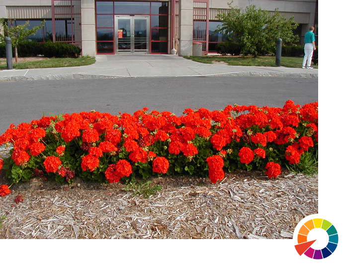
Keep in mind that each color -- whether warm or cool -- has a range of warmness and coolness.� The effect of these vermilion blooms -- an orangish red -- is far hotter�
Cool colors (violets, blues, and greens) appear to recede in the landscape.� They seem farther away than they really are, and can make small spaces feel bigger.
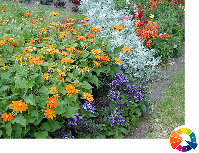
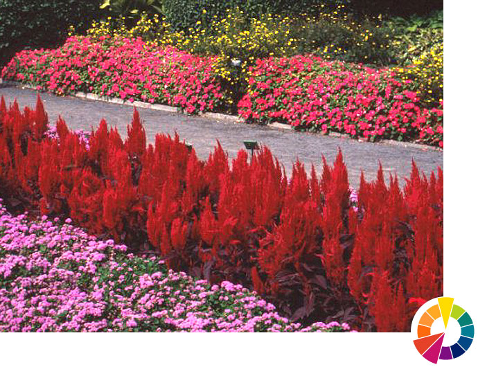
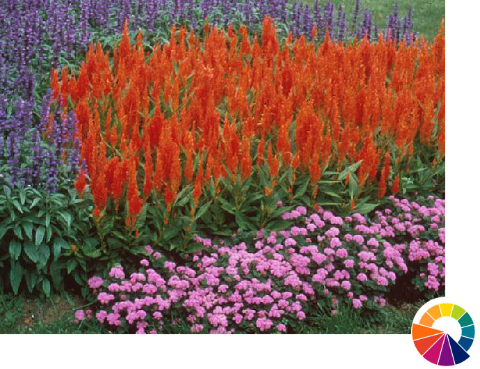
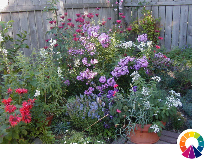
If your flowers are mostly warm colors and you want to soften their intensity, consider adding some cool-color blooms and foliage to provide contrast. Here, the fiercely hot orange celosia is cooled by the purples of surrounding blooms.
If you garden in a small space, using cool colors will make it seem bigger.
Color Wheel
Taking a closer look at the color wheel, you can see a triangle made up of the three primary colors -- red, blue, and yellow.� They are called primary because they can't be made by mixing other colors together.
Between the primary colors on the wheel are secondary colors, which are made by mixing two primaries:
orange = red + yellow
green = yellow + blue
violet = blue + red
Going one step farther, there are tertiary colors, such as blue-green and yellow-orange, between the primaries and secondaries, and an infinite spectrum of colors between those.� In our gardens, we find more of these types of colors than the "pure" primary and secondary colors.� (Artists also use the term tertiary colors to mean colors created by mixing all three primary colors to produce many of the colors found in nature from mustard yellow, browns -- from yellowish to reddish to deep umber -- and finally black.)
Image: Courtesy Don Jusko
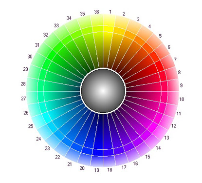
A full color wheel that shows more of these gradations is a closer representation of the spectrum of colors than the simple one we�re using to understand the basic concepts.
Color Complements
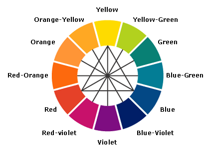
Complementary colors are located directly opposite from each other on the color wheel.� (Follow the black lines that go through the center of the simple color wheel.)� For example:
Blue complements orange.
Green complements red.
Yellow complements violet.
Because the secondary color in each complementary pair is made up of the other two primary colors, you can think of these combinations as having all three primary colors.� The complements "complete" each other.
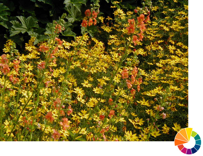
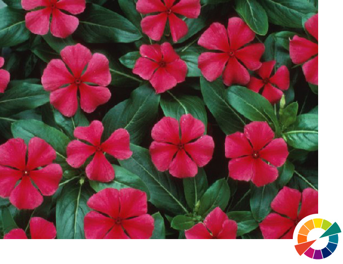
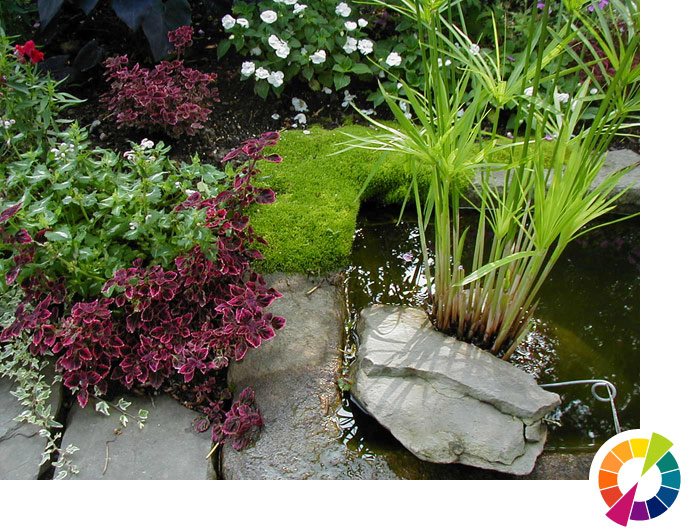
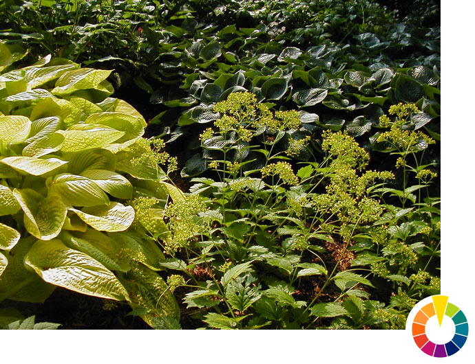
Analogous combinations harmonize or blend together.� In this example, we have the yellow flower, the yellow-green leaf margin, and the green leaf interior represent all colors found close to each other on the color wheel.
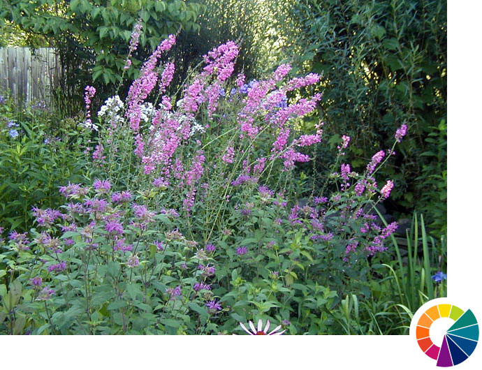
If using three adjacent colors, try using the middle one as the predominant color, and the others on either side of it to a lesser extent.� Here, blossoms on the bluish side and reddish side of violet are subordinate to the violet blossoms.
When using analogous colors, try keeping their intensities the same.� Intensity refers to the amount of gray an instance of a color contains.� An intense or saturated color has little or no gray.� Desaturated colors (called tones) have more gray added, and appear muted.
The monochromatic "moonlight garden" features all white blossoms that are particularly attractive at dusk or at other times when light is low.� Differences in plant form and texture become more pronounced in the monochromatic garden as the garden deemphasizes differences in color.
The triad theme uses three colors evenly separated on the color wheel, such as all three primaries (red, blue and yellow) or here, the three secondaries (violet, orange and green). Using triads in full intensities yields a very vibrant, energetic harmony.
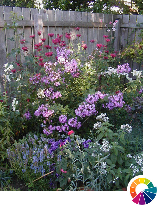
Another strategy is the split complementary theme: Start out with a complementary pair, such as yellow and violet.� But take one of the colors and use the colors close by on either side on the full color wheel. In this case, the yellow flowers in the foreground form a split complementary pairing with the reddish-violet and bluish-violet flowers in the background.
Shades and Tints
Image: Courtesy Don Jusko
Another aspect of color involves adding white or black to pure hues.� Adding white lightens color, and the result is called a tint.� Adding black darkens the color and the result is called a shade.� For example, pink is a tint of red and maroon is a shade of red.� Note the full color wheel includes increasingly lighter tints toward the outside and darker shades toward the center.
Shades -- in this case a rather dark shade of yellow -- have a low-key effect, making the scene more somber.� Their color holds up in the middle part of the day when there is plenty of light.� But they fade toward black as light decreases in the evening.
Tints--in this case the lighter yellows in the foliage and flowers -- have a brightening effect.� When the sun is high and unobscured these plants may appear washed out, but later in the evening they will remain evident when the darker shades have disappeared.
In addition to the colors on the wheel, you can make use of neutral colors -- black, white, and gray -- and earth tones such as brown, tan and olive to create certain effects.� All make good backgrounds to accentuate other colors.� Here, a dark background makes the foreground appear lighter.� Lighter backgrounds will appear to darken blooms in the foreground.
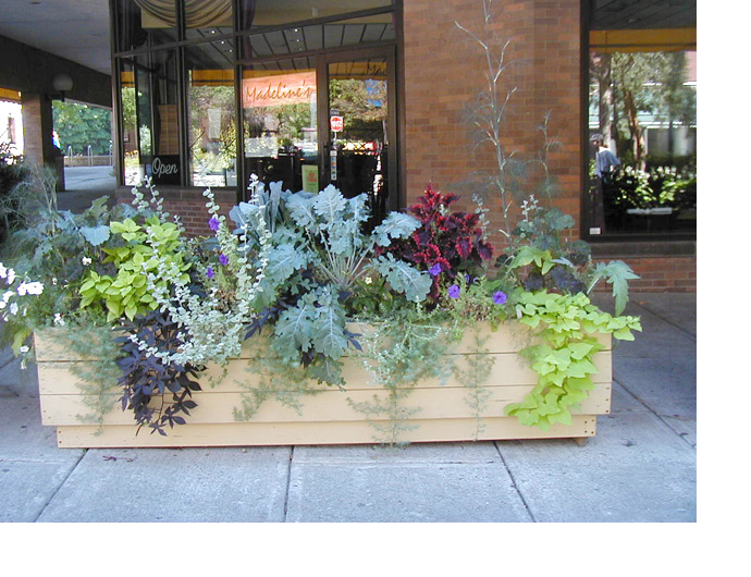
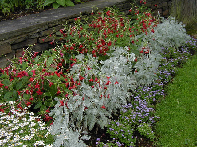
You can use neutral colors as "punctuation" in the garden. Here, gray foliage plants and white flowers are useful to help separate combinations of plants using different color schemes.